The New York City Department of Parks & Recreation has a vision to "create and sustain thriving parks and public spaces for New Yorkers"1. Every 10 years, volunteers and staff from NYC Parks & Recreation have collected information about street trees of NYC, starting from 1995. The collected data contains species, diameter, the percepted health of the tree and much more. Using NYC OpenData containing the street tree datasets, this project seeks to enlighten the interested readers into the topic of street trees in NYC, by mean of beautiful and interactive visualizations.
The dataset that has been analyzed for this purpose is the 2015 Street Tree Census data. As supplementary data, the Street Tree Census from 1995 and 2005 have been analyzed as well. In the next section, it is possible to click different images and hereby view different visual aspects of the Street Tree Census data. Here, you can view differences between the five boroughs of NYC: Bronx, Brooklyn, Staten Island, Manhattan, and Queens with regards to the most common trees, amount of trees, area etc. It is also possible to view differences between the years 1995, 2005, and 2015, and to view details of the most common trees. For a much more detailed and technical understanding of the project, the visualizations, and the methods used, please use the download link available in the bottom of this section or go to the data set available at the OpenData NYC. You can also view it here For some parts of the project, we have also explored certain parts of the 311 dataset, as well as the air pollution dataset.
Now, take a look around, and have some fun getting to know the street trees of NYC!
So we know that NYC is divided into 5 different boroughs. Those are then divided into 52 different community boards, which are again divided into 188 different neighborhoods. Our modified Street Tree dataset consists of 534,514 tree observations and 21 features, totalling 74.5 MB. It contains only relevant features and data for the 20 most common species. For more details about the data extraction, have a look at our notebook
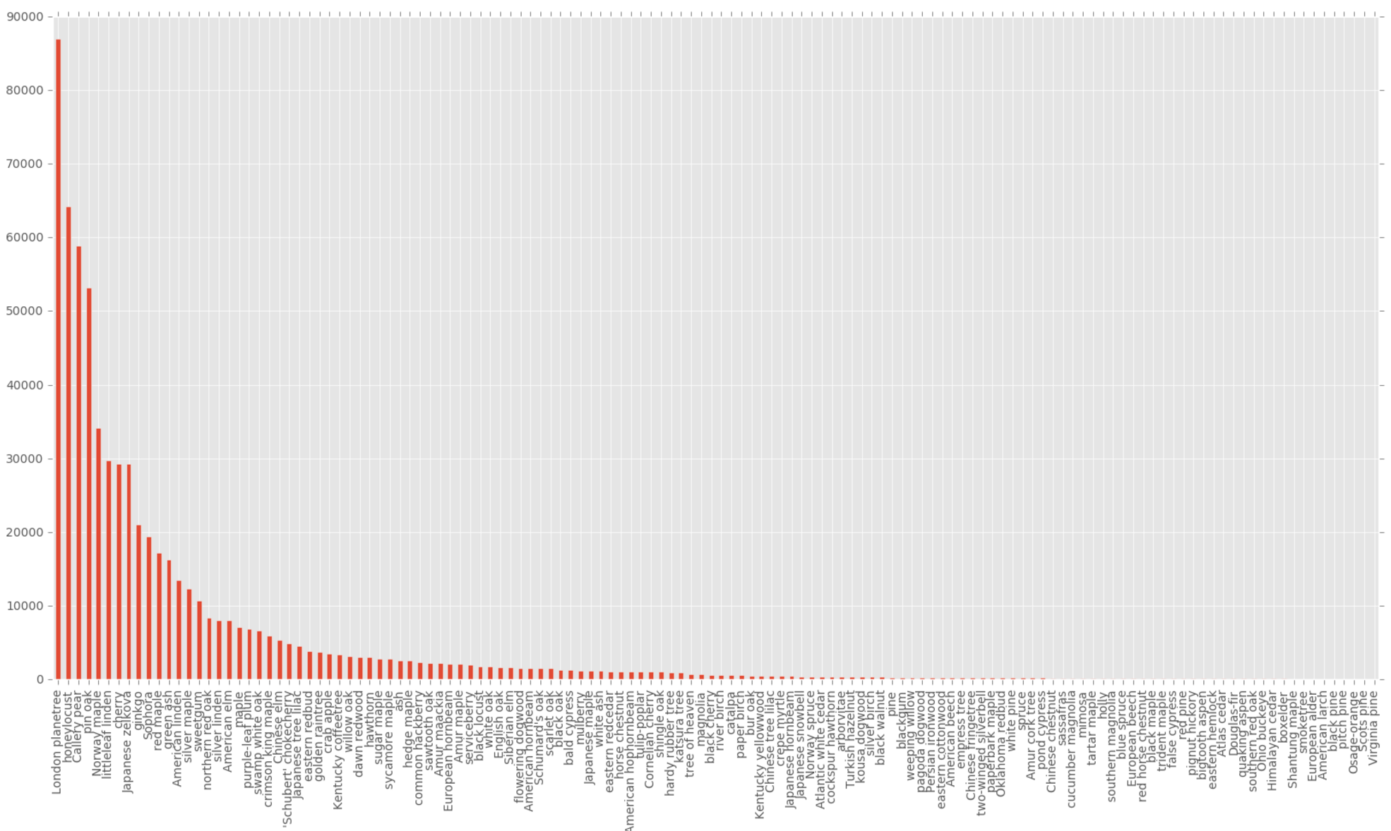
By now, the clever reader might have figured out, that there's also (at least) a handful of trees in NYC. Below
is a plot of the frequency of all the different species of trees in NYC. As you can see, there is a lot of
trees in NYC, in fact, they amount to 683.788.
Now, let's
focus on just the 20 most common tree species. Below you find a pie chart showing the percentage distribution
of the top 20 species.
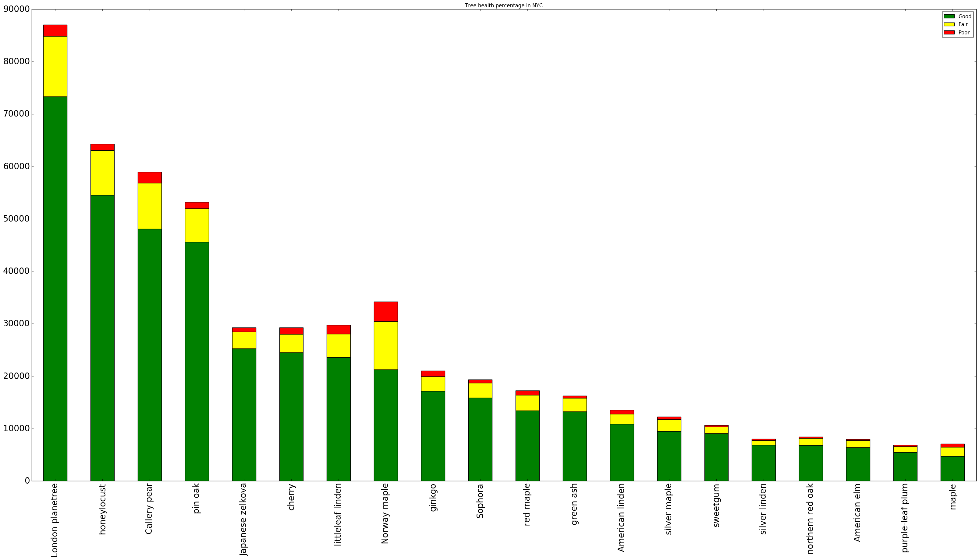
Actually, there is no reason to focus on the top 20 species. The frequency is simply becoming too small. In the following
we focus only on a smaller subset of trees.
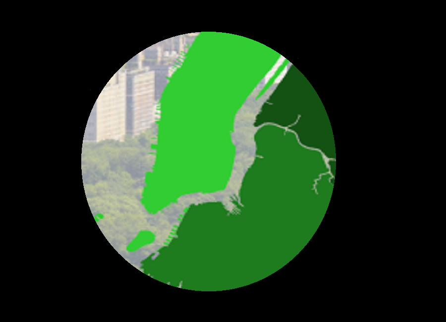
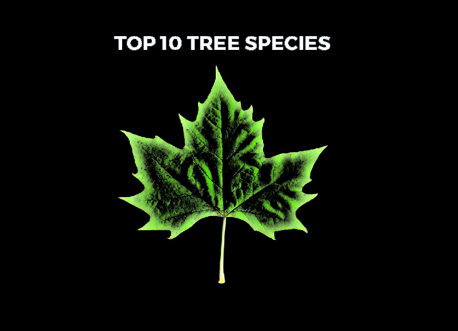
Click the image below to get to know your top 10 trees.
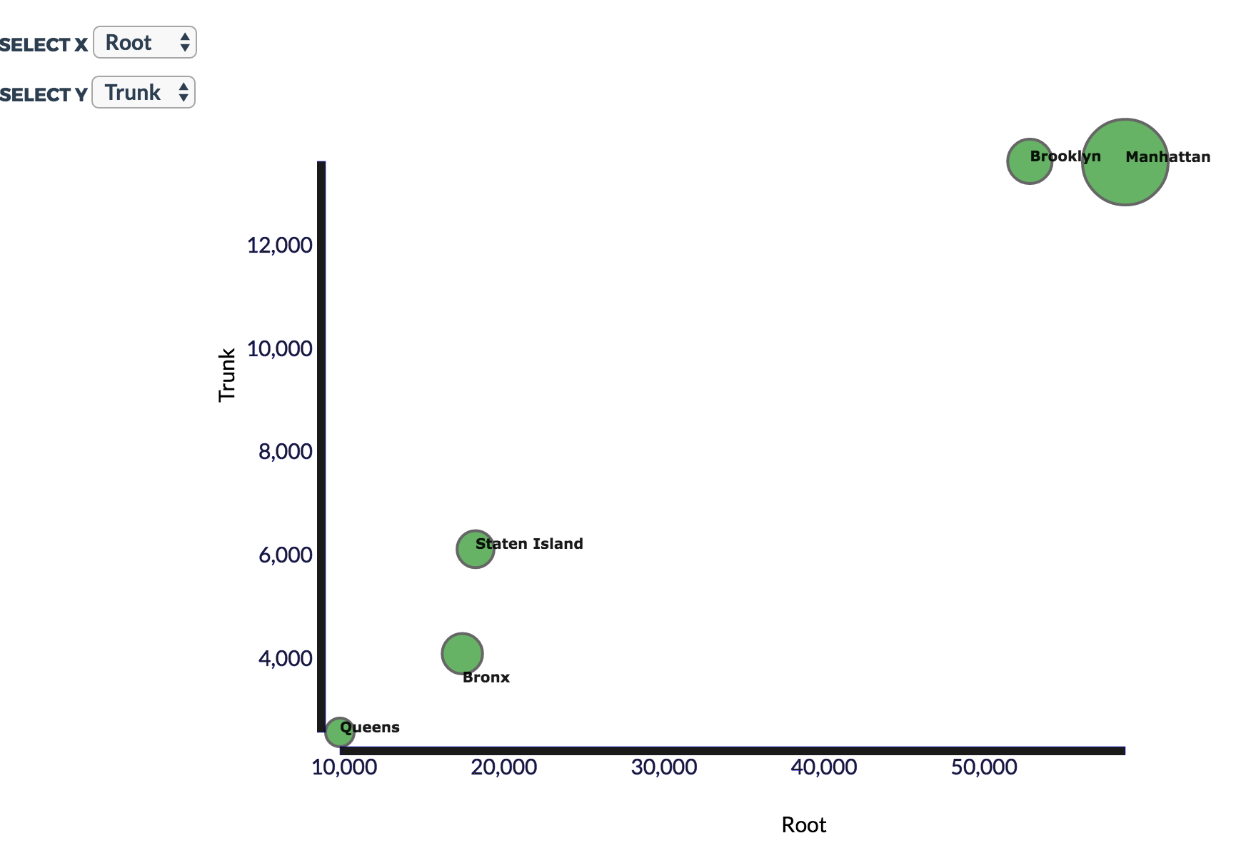
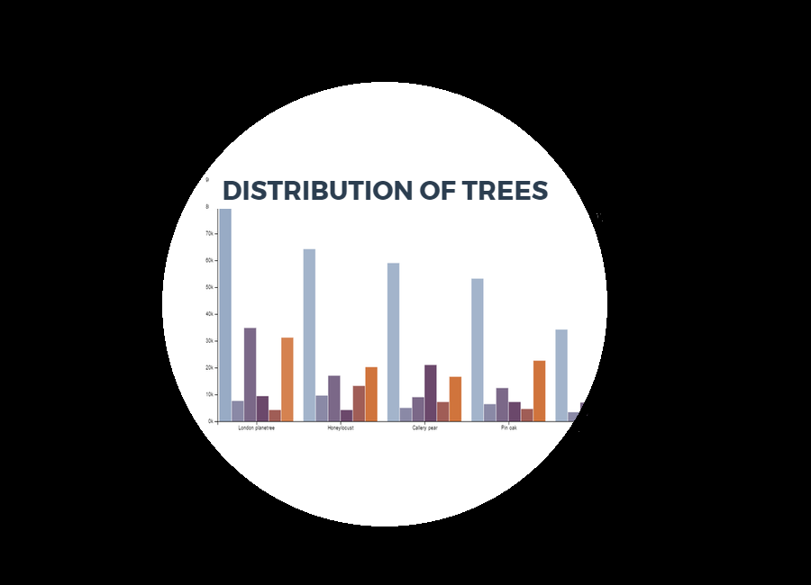
Now that you have had the time to check out the most frequent species, and probably gotten to know them a little better, wouldn't it be a good time to take a closer look at how they are distributed across the different boroughs? Click the image below to see an interactive visualization of the distribution of the top 5 trees in NYC and the five boroughs.
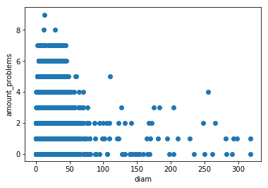
We have also used KNN to predict the 20 most common species based on their location. From this classification, it can be derived that the same species is not necessarily planted next to each other. Details about this can also be found in the Explainer notebook.
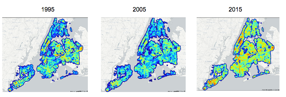
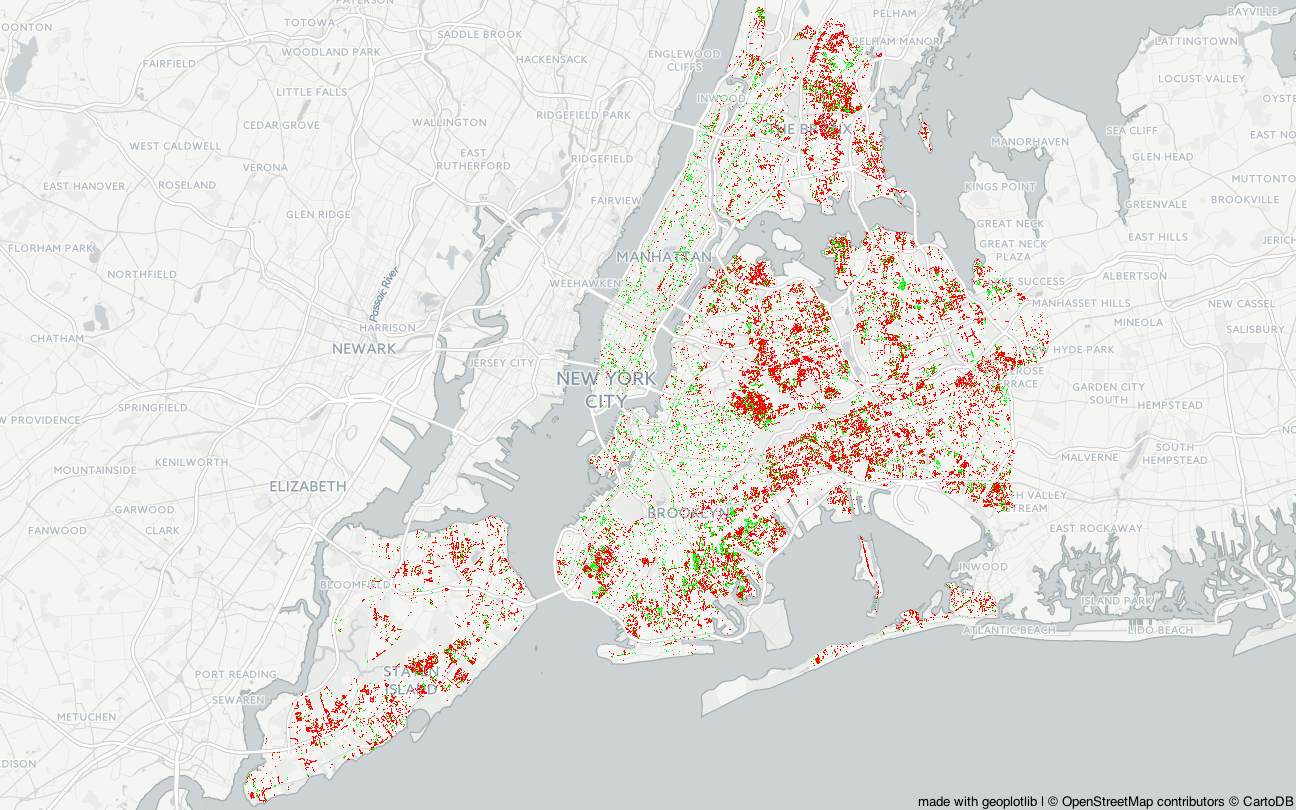
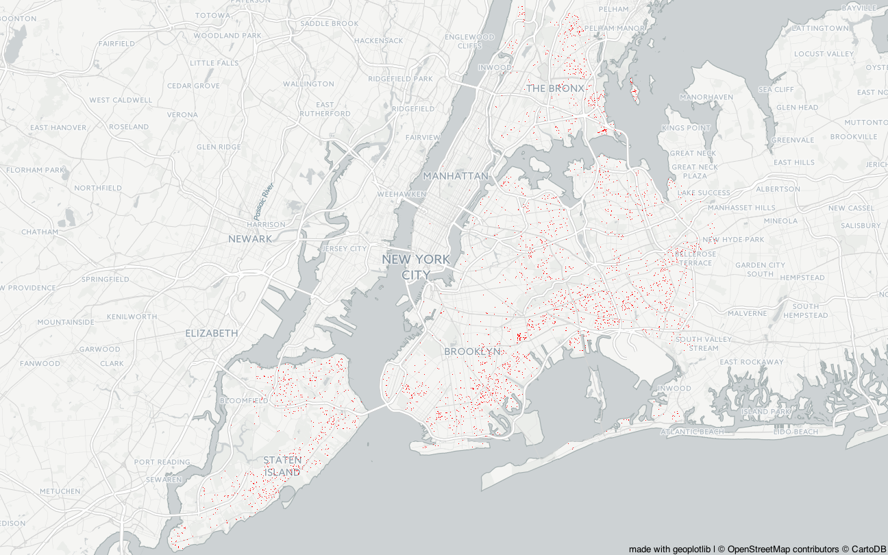
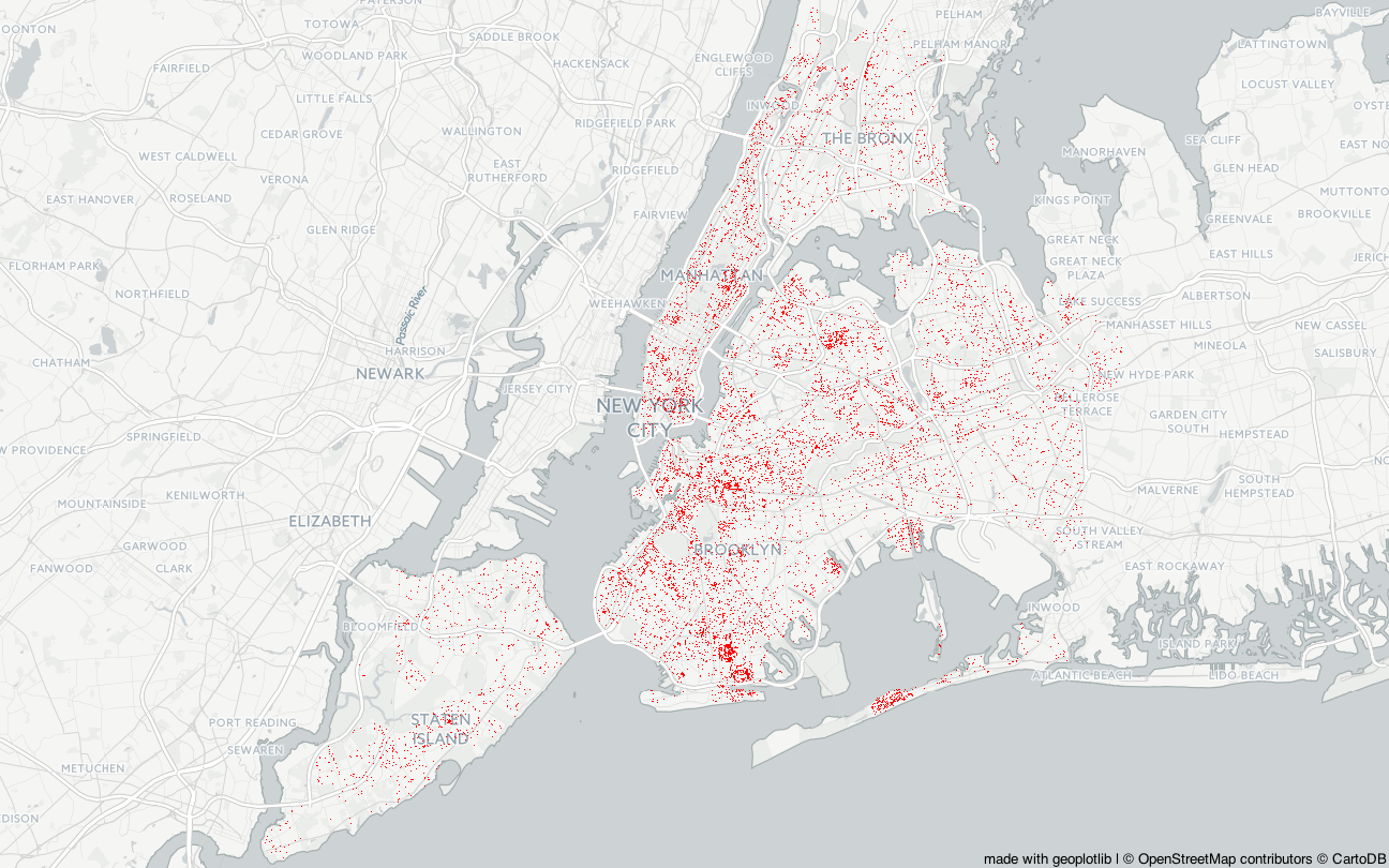
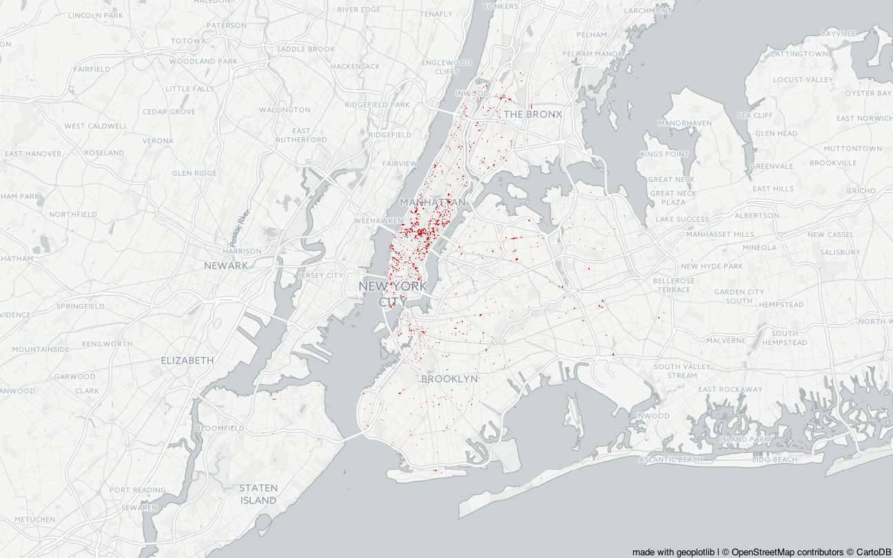
In the three heatmaps below we can see the total distribution of all the trees. Plotting it on a heatmap like this, makes it easy to see how the amount of trees have grown a lot throughout the years in almost all areas of the city.
Having thousands and thousands of trees standing around in a harsh, urban environment like NYC, makes
you wonder what will happen to them and their surroundings, since they are dynamic, living organisms that
develop over time. Just as humans, trees can get sick and die. They can fall over, into power lines and phone
lines, onto roads etc. They can also be a nuisance for the people living near them if they start looking
old or sick.
Because of this, there can be value gained from knowing the health status
of the trees around the city. Below is a plot of the health status of the top 20 species. It is worth noting,
however, that the dataset is based on a community survey, the data is collected by volunteers, so the basis
for the trees' health is solely based on perception of the volunteers collecting the data. The plot shows
the top 20 trees and their health, in descending order of 'Good' trees.
From the bar chart we can see that, in general, most trees are in good health, but some species have more trees in "fair" or "poor" state than others. Especially the Norway Maple species have a lot of trees in either poor or fair state. Both London Planetrees, Honeylocust, Callery Pear and Pin oak also have a large share of trees in fair (or poor) state, but it is also the most common species with a substantial amount of trees.
There's quite a lot more trees in good health than there are trees in bad health. To get the percentage of good, fair and poor trees, and to further visualize the total amount of the trees' respective health status, here's a pie chart:
Click on the image below to see a map of NYC, showing the results of a KNN classification of tree health, based on their GPS locations. The purpose of this visualization is an attempt to give an easily understandable overview of the tree health status of the trees around the city. For more details about the classifications, please view the iPython Explainer Notebook, that can be downloaded from the top of the page. As a note, we have also used other machine learning techniques for this classification, e.g. Decision trees, though those have not been visualized, as the dendogram was too large to view and interpret properly.
We discovered that the health status is not directly related to the problems that the trees may have. The problems are artificial, and caused by humans, e.g. putting fences around the trees or lights positioned so that the branches grow into them. For more details about problems, move to the next section.
Click on the image below to explore the amount of problems in the five boroughs of New York City.
You can see the percentage of the problems in each borough respective to the total amount of problems that could have
been there. Each tree can have a max of nine problems, so if an area has 100 trees, maximum 900 problems can be presented.
You can explore the problems grouped into 'Root', 'Trunk' and 'Branch' related problems.
The complete list of problems that a tree can have is 'Trunk:Wire,Light,Other' and a branch can be 'Branch:Light,Shoe,Other'
and root can be 'Root:Stone,Other,Grate'.
You have noticed that Manhattan is the borough with most problems out of the five and Queens is the one with fewest. This does not reflect the total tree amount in the areas, as we have seen earlier that Queens has a lot more trees than Manhattan. The problems are influencing the growing-process of a tree. This means it has a direct influence of the diameter of the tree, as we can see in the image below, where the average tree diameter is shown for each community district.
Here we can also see that there is a lot of smaller trees (smaller diameter), probably because a lot of them were planted recently. In fact, there was a growing number of trees from 1995 to 2015. However, the diameter size counts because it can influence the air pollution since bigger trees have a positive impact on the air quality (reference). In the next section, we are going to explore the influence of trees on the air pollution.
The air quality is influenced by the diameter of the trees and the amount of trees in the area. Clicking on the image below, you can explore the influence of trees on the air quality in each neighbourhood. It is possible to see the effect on four different air quality measures NO2, O3, PM25 and Black Carbon. Each point in the scatterplot you are going to see corresponds to a neighbourhood in New York City. The map on the side is showing you the community districts, in which the neighbourhoods belong to, and the corresponding boroughs. You can hover over each point in the plot to see the corresponding district, and you can hover over each district to see it's corresponding points. Note that, when clicking a button, both the graphs change. Have fun!
You can see that the trees (and the diameter) influece the air quality in a positive way. The only exception is ozone, O3. There are some scientists who claim that trees in the city are not necessarily good for improving air quality. It's interesting to see that most of the points in the plot are near each other in each borough and that the highest average diameter is in Staten Island, while Manhattan is doing pretty poor compared to the rest.
As we can see on the map below, the problems with the trunk shown as red dots and branch wire problems in green. We can see that there are some clusterings in the same zones, which could be explained by a large amount of power lines. In fact, there are some spots in the same areas from which most of the 311 complaints are coming from regarding trees hitting powerlines, which can be seen in the second plot.
We can see that Brooklyn is placed in the middle regarding air quality classification, and most of the new tree requests are from the areas in Brooklyn, which could indicate a wish to improve the air quality.
Most of the root grate problems are in Manhattan (which is generally the most problematic borough in regards to air pollution), even if not for ozone.
All of these 'problematic' areas definitely require some more exploration as there is potentially a lot of value to be gained here.
It could be interesting to explore more in these areas, the complaints and how each area takes care of its trees. This might happen in the future, in the meanwhile, we hope that you have enjoyed this walkthrough of New York City's trees.